

Welcome to another designer diary, hopefully some of you for the first time as you read from the Kickstarter campaign!
The Spark!
The initial idea for Cartographic Divide was a rather simple one. I had the thought of a canvas split in two, with a wavy line that undulated across the split, forming voids on either side of the split. Now that I wrote that out, it sounds surprisingly confusing, so here's the initial sketch:
Where to Go From Here?
Of course, having an initial concept is great, but as you can see, that initial sketch is quite boring! As I was pondering what direction to take with it, the idea of a topographic map came to mind. My college degree is in Landscape Architecture, and for two years in my early 20's, I was an urban planner. Urban planners look at and manipulate lots of topographic maps, so with this blast from the past resurfacing in my mind, I set out to find a topographic map I could use for inspiration.
I found one that I liked the look of, and used it as the rough basis:
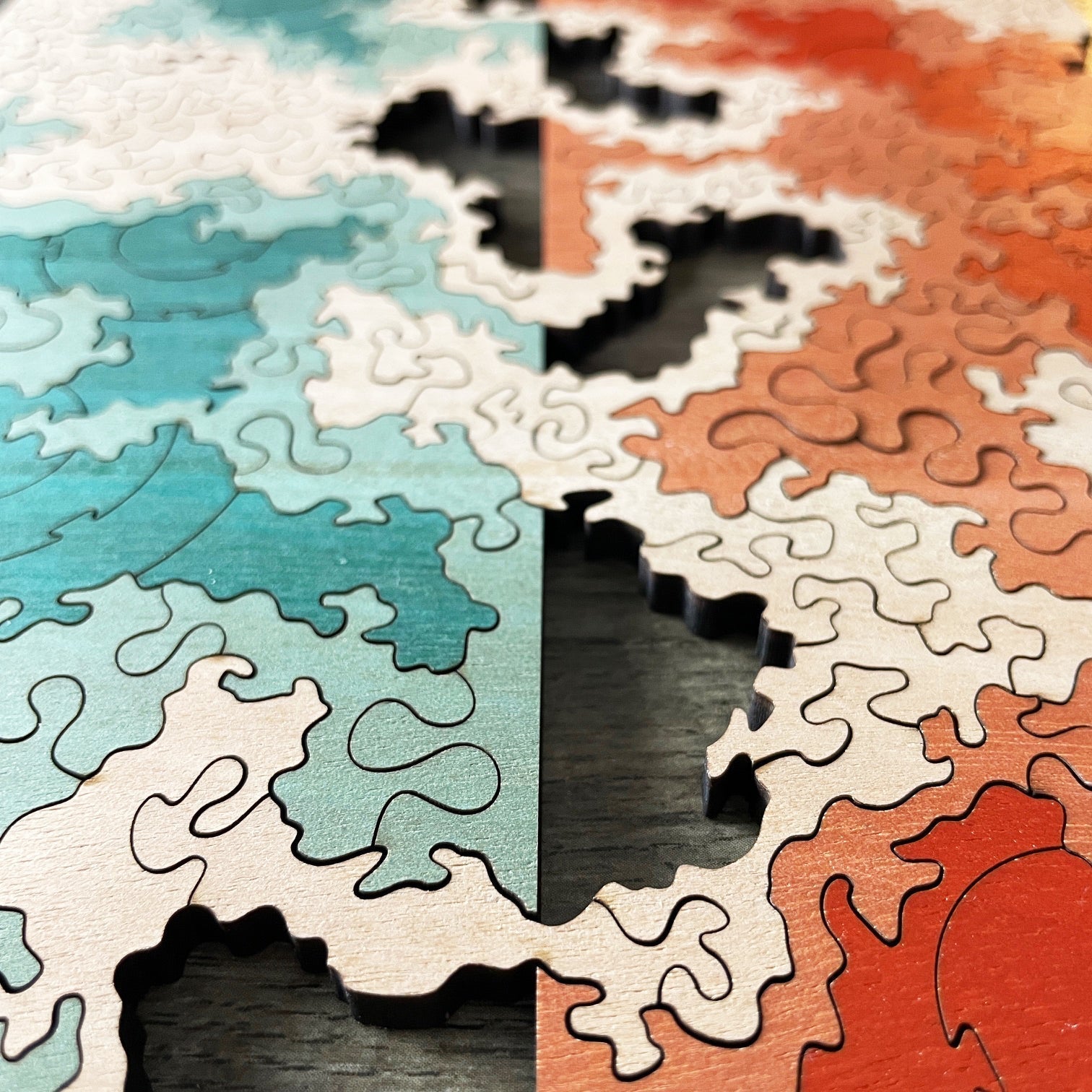
It's really hard to see without the final coloring, but using the topographic map theme, the puzzle is broken into three color-coded regions:
1) The undulating "mountain range" that crosses back and forth across the center line. This is the uncolored area of the final puzzle.
2) Midlands. This is the muted/pastel color area of the final puzzle.
3) Lowlands. This is the saturated color area of the final puzzle.
Developing the Linework
I knew the color scheme of this puzzle was going to be very helpful when solving, so I had to make the cut lines rather difficult to balance that out. Fairly detailed, random lines tend to be rather hard to assemble, so I went that route for the entire "mountain range".
To keep the puzzle from feeling too same-y, I then decided to use different styles for the midlands and lowlands. The midlands use a very curvy connector type (similar to what I used in the top layer of Party in the Back #1!).
That left me with the lowlands area. I always like design elements that clash and contrast, so I went with a series of "bulls-eye" concentric ring patterns. I enjoy the look of these quite a lot in the midst of the otherwise very chaotic cut patterns in this puzzle!
I must say, keeping the regions of the puzzle properly visualized while sketching was tough! This puzzle looks like a complete mess without the color!
Fine Tuning
The linework really needed one more pass at this point, as I felt the "squiggly" linework was a bit too jagged and angular in many places. I retraced everything to smooth it out a bit.
The bottom-right in particular also needed more than just a retrace. It needed some real reshaping and massaging since it felt a bit heavy on the lowlands "bulls-eye" pattern.
Speaking of that bottom-right section:
The Details of Puzzle Design: "Bridge Connectors"
Perhaps there's a proper puzzling term out there for this, but I use the term "Bridge Connector" for any piece that connects two adjacent pieces that aren't otherwise connected. Similar to the first paragraph, that sounds like word salad, so let's go to some pictures!
You can see in Option 1, piece C in a "Bridge Connector" between A and B, where A and B are essentially connected together despite being not connected directly.
Alternatively, I could have designed that small area via Option 2, simply directly connecting A and B, and making piece C smaller and out of the way, but IMO, that would make for a less interesting connection!
I'm certainly not the only puzzle designer that uses "Bridge Connectors", but I just thought this would be a fun detail to point out to show how a puzzle designer has to have a keen eye for details and puzzle connectivity. The design decisions are constant!
The Grand Finale
Unlike many of my designs, I'd already decided on the color scheme from the outset, as designs with this sort of hard split in the middle lend themselves well to a "fire and ice" design scheme. While it's not super original, it's impactful! So, I simply went with blue on the left, and orange on the right. I think the result is quite stunning!
Applying the color is extra fun in these more abstract puzzles with a very busy connection pattern, as the overall design is rather indecipherable until the color is applied! It's a relief to find I hadn't confused anything in the design process! Phew!
Hope you enjoyed the peek inside my brain! Enjoy the puzzle!
Love and blessings,
Chad
P.S. If you're reading this, and don't know this puzzle is currently available on Kickstarter, you can find it here:
https://www.kickstarter.com/projects/puzzlebomb/bumfuzzled-spring-2025-collection?ref=cgrby3
Designer Diary - Bumfuzzled #19 - Cartographic Divide
2 comments
Glad you enjoy it, Will! You know, I don’t think I thought of the bulls-eye pattern for any thematic reason; it was more I liked the contrasting style. But, now that you mention it, they do look potentially look like areas impacted by human activity in the lowlands! :D
Looking forward to this one, and I love maps. When you were designing the bullseyes, were you thinking they might be cities in the lowlands?