Welcome to another designer diary, where I'll take you through the design process for Unmasked Bosc! This one was born by merging two puzzle concepts I wanted to design.
Design Concept #1 - The Zipper
The first concept was some sort of object, where an open zipper revealed the insides of that object. It's been well over a year since I drew things up, but I remember my original thought was a very vanilla geometric shape, with the zipper revealing wacky shapes inside that almost popped out like confetti. Here's that first, very boring, sketch of the basic idea!
Design Concept #2 - Super Swirly Whirlies
I'm a modest collector of hand-cut wooden puzzles, particularly cutters that do more intricate, abstract cuts, like Thom Spencer, John Stokes, and more recently, Philip Morganelli. This particular puzzle by John Stokes has always stood out to me (apologies for the poor image quality, as the internet only had a low res version of this puzzle):
I think, for most artists, we're always iterating on things we've seen and liked, whether we're conscious of it or not. In this case, quite consciously, I decided that the "zany" part of this puzzle would emulate the super fun swirls on this, at least to the best of my ability.
Side note: Cutters that cut these designs out on a jigsaw are insanely talented, as they cut these shapes out in one pass. No erasers or redos. You'll soon see just how much erasing I had to do in my drawings in order to end up with something that probably still isn't as stunning as John's work here!
Enter the Pear!
As I was brainstorming some more, I eventually felt like the original rectangle base was quite boring, and eventually settled in a pear, because, why not? Here was the first pass at combining the zipper with a pear.
I'd also added the horizontal stripe here, for a couple of reasons:
1) I liked how it provided continuity between the bottom and top halves.
2) You'll notice in many of my designs, I tend to insert unexpected elements to break up the monotony of sections where there's a lot of the same cut pattern. The river/forest in Bumfuzzled #2, the green geometric doodads in #6, the chevrons that cut through the sky in #7, or the beam of light in #9, for example.
I think these kinds of elements both make the art more visually interesting, and also make for a much more fun and interesting solve than if the entire puzzle was all the same cut pattern or style.
Two Opposing Design Styles
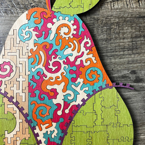
Along those lines of using different cut styles in the same puzzle, I wanted the base of the pear to be very "vanilla", although still interesting and challenging to solve. This was especially needed since the top half with all it's unique swirls, while being very visually striking, would be quite easy to solve since each swirl is so distinct.
So, I went with a very Eames-era esque series of rectangles for the bottom half, while filling that top half with intricate swirls.
A couple of things to note:
1) The reason for the incredibly muddy scan of the swirly area is due to the copious amount of erasing I did along the way! As I mentioned above, much respect to the folks cutting stuff like this in one pass on a saw!
2) I really enjoyed how, with the leaf at the top, there were now 4 segments of puzzle with the rectangular design, as four separate sections of the same design makes for a challenging solve to offset the ease of the swirl section. The leaf also makes for an unexpected blip of that cut pattern and green color!
Final Touches
Obviously, I still had to add connectivity to the rectangular grid, so I went to town with a few connector styles, varying the combination and quantity of them along each cut edge.
This is a part of the project I do digitally, as I wanted the connectors to be very uniform to increase the trickiness, which is too tough to do consistently by hand. I also took this time to clean up the swirly section, so the guy that does my digital tracing could make out the linework much better!
I also enjoy the vertical band in this one, which is rather small in piece count, but doesn't reveal many secrets as to how the pieces should be arranged. The Tetris-y pattern in this section almost falls more into brain teaser land.
The Final Step - Color!
I knew I wanted to keep the pear a traditional green, which would make the zany, colorful interior that much more of a surprise to the viewer. Who would expect such a plain-looking pear to contain that kind of excitement!?!
Since purple is so dark and high-contrast vs. the rest of my palette, it was a perfect fit for the zipper, which is otherwise such a minor element.
I wanted to keep the vertical band fairly nondescript or attention-grabbing, so I went with plain wood there, using a couple slightly darker shades to add interest.
The rest of the colors were great for the spirals, as they mellowly blend together, while still keeping each spiral very visually distinct.
All-in-all, from concept to final art, this puzzle represents a couple weeks worth of on-and-off design time.
The Final Result!
Since I design so far ahead of schedule, it's always a delight after the year+ passes until a puzzles' turn for sampling arrives. I often get to be surprised by my own designs that I half-forgot in the interim! 😆
This one ranks as one of my all-time favorites so far, and I hope you enjoy it every bit as much as I do.
I also figured out how to activate comments for the blog posts, and would love to hear from you!
Blessings,
Chad


4 comments
Rosemarie,
One layer of Party in the Back #1 has a connectorless section, and the Toomuchery series has a couple of connectorless push-fit sections that are contained by the surrounding puzzle. I love working in all kinds of cut styles!
Thanks,
Chad
I love these little glimpses into the creative process and design decisions! It makes me think more deeply about my other puzzles and how the different elements combine or contrast to make a more enjoyable puzzle!
Very nice puzzle. It was great to be able to follow along with your creative process.
Have you ever considered having connectorless sections in your puzzles? I think that would be fun with all your wonderful crazy cuts in other areas.
Looks beautiful. I think you really captured the concept of simple on the outside, exotic on the inside. It looks how it tastes!